Wednesday, October 15, 2014

Border Play Problem B: Type Specimen Sheets


After exploring many fun fonts, (and a few that looked exactly the same), I decided on Memphis. It expresses the
playfulness and spontaneousness of my imaginary polaroid photography company, "Why Not?" perfectly. All
capitals and bold achieves the shock value necessary to catch my potential audiences' attention.

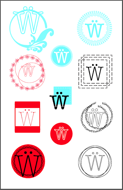
Border Play Problem A: Nine Different Borders


These are the result of many glyphs, lines, circles, colors, and other attempts at creating
interesting yet functional borders. My glyph has a ton of personality, so it was somewhat
easier to build a "look" around a structured icon expresses has human-like emotion.

Wednesday, October 8, 2014

Emotional Color Problem B: Communicating Color Through Text

Pink is my favorite color for reasons unknown to me up until now. I thought I simply enjoyed the way it looked, but it turns out there are proven psychological reasons for humans desiring the color pink. It is stimulating and calming simultaneously, and used to paint U.S. jail cells for these reasons. It is an appetite suppressant, relaxes muscles, and is soothing. For women who are often overworked and overburdened, an attraction to pink may speak of a desire for the more carefree days of childhood.

Emotional Color Problem A: Digital Image Color Swatches

The Hindu Festival of Holi is a welcoming of Spring, and a celebration of the triumph of good over evil. Participants drop their inhibitions, throw colored paint, powder and water over each other. These photo samples have extracted the true essence of the pigment of each of the assigned colors, and a couple of extras. The highlighted and sometimes "hidden" colors are brought to life when separated like this.


Thursday, October 2, 2014

Color Problem B: Paint Color Relationships

The sketch that started the most mind blowing color journey I have ever taken with a paintbrush.
Okay, I know I just created my own colors from the primary color basics, then added black or white to tint or shade...
BUT for someone who didn't know this was possible; mind blown.


Some found objects changed the concept of the shapes I will use. 

Time to use the reflect tool for perfectly symmetrical shapes!


These two colors [bottom: purple top:green] I created, lost all vibrance 
when they hit the paper and dried. Finally I decide to use primaries!


Red, yellow, and blue. Not until I painted them, did I understand their true depth and beauty.


Problem: Complementary Colors with Black Shape.


Problem: Analogous Colors with Black Shape.


Problem: Tints of One Color With White Shape.


One last close up photo of the blues I painted. Absolutely, simply beautiful. 

Color Problem A: Grayscale Ladder

I painted my grayscale ladder in all it's complexity about eight times, and mixed & matched the best tones I could create. The magazine articles were switched out equally as much, and the end result does not show up on the screen well, but in person the steps are noticeable. 

Wednesday, October 1, 2014

Texture Problem B: Text Texture


Creating texture with typography was easier than I imagined, and I really got into the details of each font type, size, spacing, color, and specifically attempting to make sense of the content of the stories wherever possible. 


Texture Problem A: Describe Physical Texture


I used a poetry style typography approach to describe three different physical textures as detailed as possible.

Visual Principles Problem C: Emotions

Here are three emotions, expressed through simple shapes and no color.